A dial made in reverse
What collectors call gilt was once a way of making the dial, where the metal was left visible through the black surface and sealed beneath lacquer.
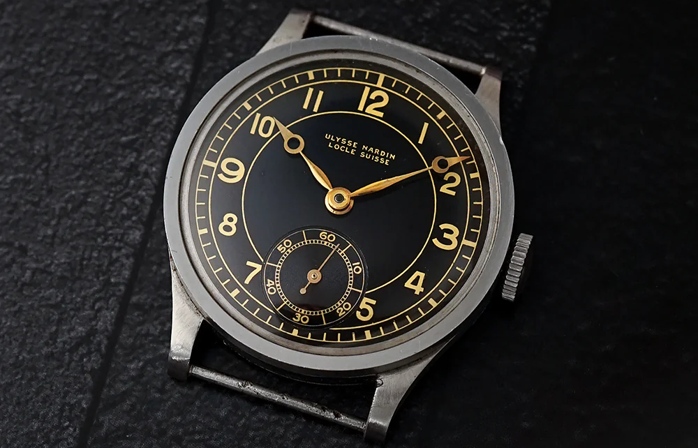
A gilt dial is easy to recognize from a distance. The black surface is glossy, the text is warm, and the logo, minute track or lettering seems to sit somewhere below the surface rather than on top of it. On the right watch, the effect can make a black dial feel less flat and more alive.
That appearance is also why the word became easy to simplify. Today, gilt often means gold-coloured text on a black dial, chosen because it looks vintage, warm and familiar. Historically, the most interesting gilt dials were not simply black dials with gold printing. Their warmth came from the way the dial was made.
A dial made in reverse
Most watch dials begin with a thin metal plate, often brass or another copper-based alloy, which is then finished, coated and printed. In a true gilt dial, that base material remains part of what the eye sees. The markings are not applied as the last layer. They are preserved while the dark surface is built around them.
The exact process varied between makers, but the principle is simple enough. The parts that should remain visible are protected or defined, the black surface is applied, and the exposed metal forms the lettering, logo, minute track or other markings. A clear lacquer is then applied over the dial, sealing the result and giving the surface its gloss.
It is a dial made in reverse. The gold was not the final layer. It was what the black layer left behind.
That is why older gilt dials can look so different from later gilt-style watches. The text does not always feel like it is sitting on top of the dial. It can appear recessed, suspended or held beneath the surface, depending on the light. The word describes an appearance, but the appearance came from a method.
The lacquer does half the work
The lacquer is not only there to protect the dial. On a glossy gilt dial, the clear surface changes how everything reads. It deepens the black, catches reflections, and makes the metal underneath appear through a thin visual layer. The result can feel almost wet, especially on well-preserved examples.
Without lacquer, the construction would still be interesting, but it would not have the same character. The gloss makes the dial feel less like a printed object and more like a small polished surface with information held inside it. The black is not just a background. It becomes part of the depth.
This is also why gilt dials age in such particular ways. When the lacquer changes, the dial changes with it. It can yellow, lose gloss, crack, craze or lift. The black surface can shift, and the metal below can read warmer or duller depending on what has happened above it. On a gilt dial, age does not only sit on the surface. It changes how the layers speak to each other.
Why black dials still looked warm
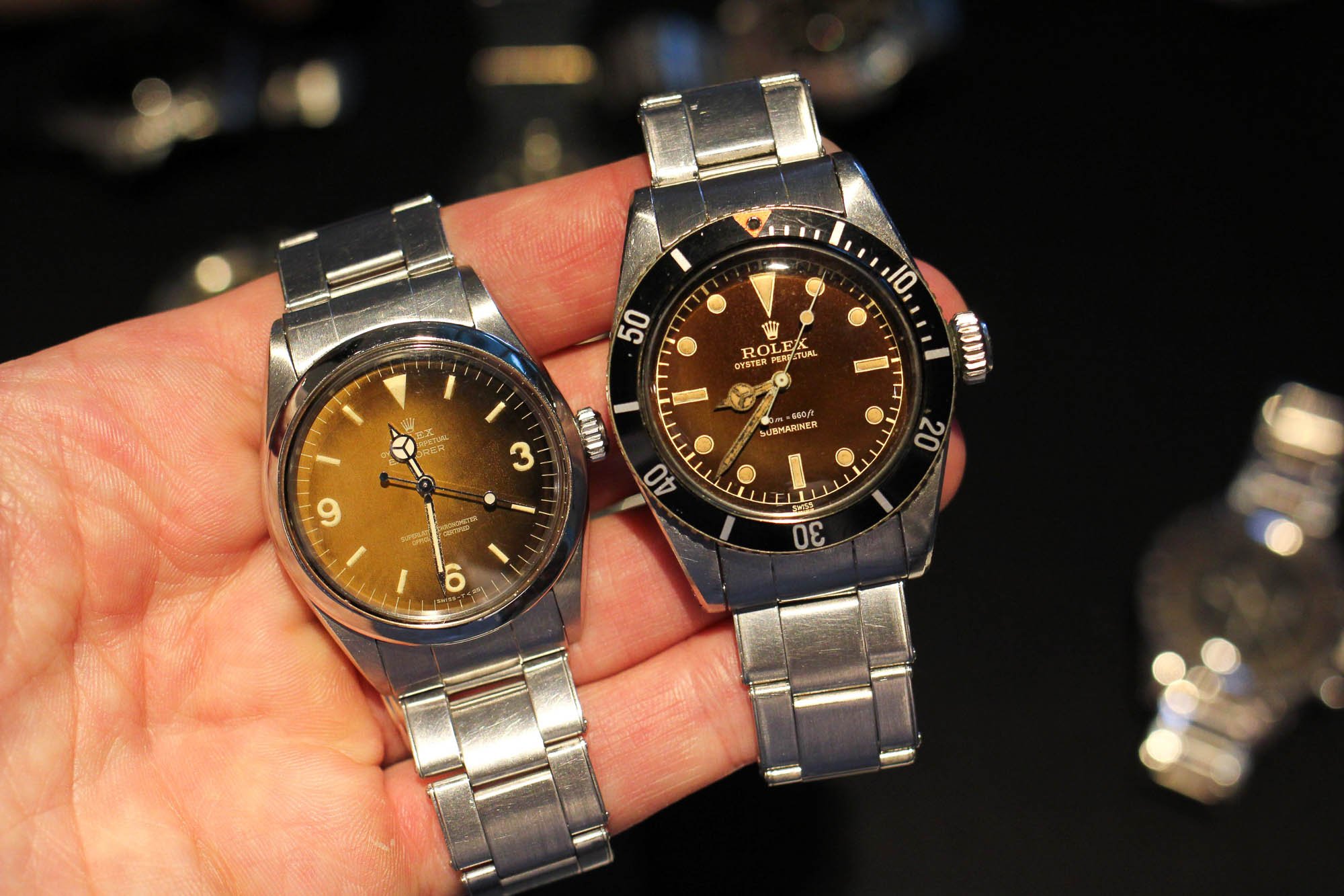
Gilt dials belong especially well to the middle of the twentieth century because black had not yet become purely utilitarian. A black dial could still be elegant. It could sit in a polished steel case, under a domed crystal, with warm hands, luminous plots and smaller proportions. The result was not the hard, flat language that later tool watches often used.
The warmth of the metal helped, and so did the gloss. A gilt dial could make a sports watch feel refined and a dress watch feel less fragile. It gave black dials a richness that modern flat printing does not always reproduce.
This is why gilt worked across more than one kind of watch. The term is often discussed through Rolex because the collector language is so developed there, but the broader idea was not only Rolex. Glossy black dials with warm metallic detail appeared across chronographs, dress watches and other mid-century Swiss watches, where a dial could feel technical and decorative at the same time.
The dial was not yet trying to look purely professional. It was still allowed to glow.
When gloss gave way to matte
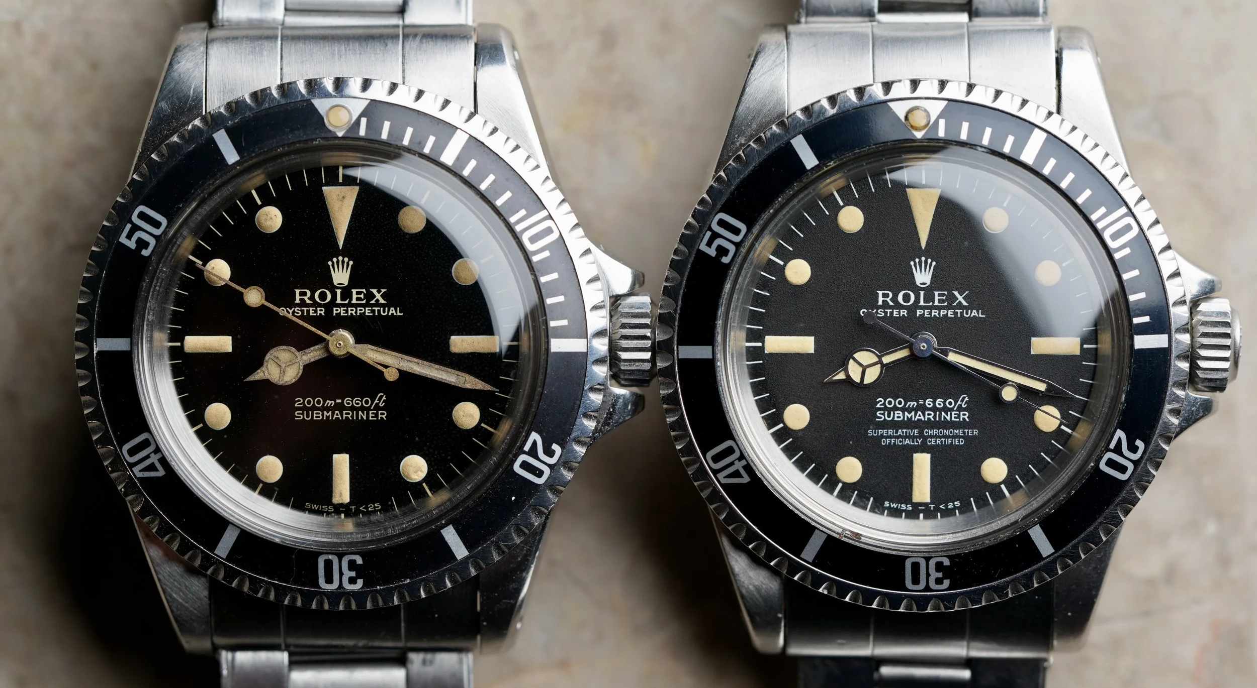
The move from gilt to matte is one of the clearest visual changes in vintage sports watches. In Rolex sports models, the change happened around the mid-1960s, when glossy gilt dials gave way to matte black dials with lighter printed text. The result was flatter, more legible and more direct.
That change was not only aesthetic. Matte dials belonged to a different manufacturing world. They were easier to produce consistently, and they suited the increasingly functional language of the tool watch. The black dial became less like a polished object and more like an instrument panel.
The old gilt dial had depth. The matte dial had clarity. Neither belongs to every watch, and neither is automatically better, but they say different things. A glossy gilt dial still carries some dress-watch warmth. A matte dial points more clearly toward professional utility.
That is why the change matters. It marks a period line, not just a change of colour.
The look survived the method
Modern gilt-style dials can be beautiful. There is nothing wrong with warm printing on a black dial. It can soften a watch, give it a vintage tone, and make a new design feel more familiar. Many modern watches use that language well.
But it is usually a memory of gilt, not the same thing. The old construction was not only about making the text gold. It was about leaving metal visible through the dial and sealing the result under lacquer. The look came from the method.
Modern gilt often keeps the colour and loses the process. That distinction matters because it changes what the detail means. In one case, gilt is a surface treatment chosen for its vintage effect. In the other, it is a trace of how the dial was physically made.
Both can look warm. Only one is true gilt.
A gilt dial is not important because every vintage-looking watch needs one. It matters because it shows how much meaning can sit inside a small detail. The colour, the gloss, the depth and the aging are all connected to the way the dial was made.
That is what makes it period correct. Not the gold tone by itself, and not the black dial by itself, but the construction behind them. A true gilt dial remembers a time when the dial was still a layered object, and when the warmth of the text came from metal left visible beneath the surface. Later watches could imitate the colour, and often did. But the original detail was not just a colour.
It was a process.